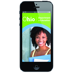
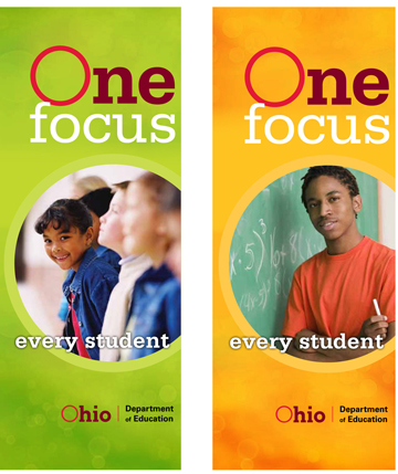
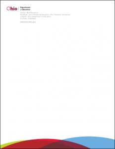
The Ohio Department of Education, (ODE) came to my group in need of quick support. They were loosing their in-house design staff and had a lot of projects and work to be done. I worked with them for about 11 months while they restructured their team.
In reviewing their past work, I noticed they did not follow the brand for the State of
Ohio. Their pieces all had different looks, feels, fonts, colors, etc. I was told by their designer that she really didn’t follow the brand. She really didn’t quite know what to do with the State’s brand and found it limiting. Well, I disagreed. I felt that the State of Ohio had a brand that was not only flexible but current and easy to work with. I also felt that I could do more with less by utilizing what was there instead of redesigning every piece with a new look. I shared my views with the marketing leadership at ODE that the brand was in fact flexible and that I would like to use that brand to give them their own unique look and feel to their materials. With that in mind, I along with my team developed a sub-brand and executed about 50 projects with a new and fresh look that was associated with the State of Ohio brand, but unique to ODE.
Some of the many items I designed and/or art directed were:
• Logos & Graphics & Icons | Stationary | Graphs & Charts
• Many digital headers and small online pieces
• Promotional pieces & flyers
• Brochures both large and small
• Large programs for events
• Handouts
• Posters
• Templates for internal use
• Trade show booths, exhibits and banners
• Signage
